
Two types of visualization:
Data exploration visualization: figuring out what is true
Data presentation visualization: convincing other people it is true
We will mostly be focused on the first
“Data exploration” is much broader than just visualization
Importance of visualization
Before you run any analysis, build any machine learning system, etc, always
visualize your data
If you can’t identify a trend or make a prediction for your dataset, it’s unlikely that an automated algorithm will.
This is especially important to keep in mind as you hear stories of
“superhuman” performance of AI methods (it is possible, but takes a long time, and is not the norm)
Visualization vs. statistics
Visualization almost always presents a more informative (though less quantitative) view of your data than statistics (the noun, not the field). Despite the temptation to summarize data using “simple” statistics, unless you have a good sense of the full distribution of your data (best achieved via visualization), these statistics can be misleading.
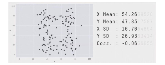
[Source: https://twitter.com/JustinMatejka/status/770682771656368128 Credit: @JustinMatejka, @albertocairo]
This is a mathematical property: 𝑛 data points and 𝑚 equations to satisfy, with 𝑛 >𝑚
Although becoming an expert in visualization techniques is well beyond the scope of this one set of notes on the topic, there are some basic rules of thumb about data, and what types of visualizations are appropriate for these different types of data, that can help avoid some of the more “obviously incorrect” errors you may make when generating visualizations for data exploration purposes. To get at this point, we’re going to review that four “basic types” of data typically presented in Statistics courses.
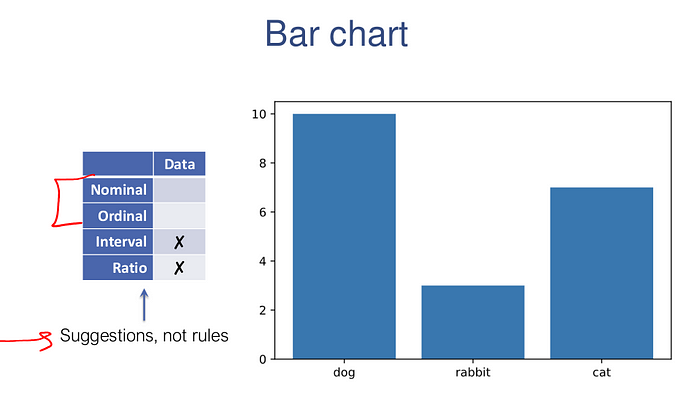
Nominal: categorical data, no ordering
Example — Pet: {dog, cat, rabbit, …}
Operations: =, ≠
Ordinal: categorical data, with ordering
Example — Rating: {1,2,3,4,5}
Operations: =, ≠, ≥, ≤, >, <
Interval: numerical data, zero doesn’t mean zero “quantity”
Example — Temperature Fahrenheit
Operations: =, ≠, ≥, ≤, >, <, +, −
Ratio: numerical data, zero has meaning related to zero “quantity”
Example — Temperature Kelvin
Operations: =, ≠, ≥, ≤, >, <, +, −,÷
At a course level, the first two data types can simply be viewed as “categorial” data (data taking on discrete values), whereas the later are “numerical” (taking real-valued numbers), though with the caveat that some level of discretization is acceptable even in numeric data, as long as the notion of differences are properly preserved. Indeed, most of the later discussion on visualization will fall exactly along the categorial/real differentiation,
We will use the matplotlib library, which integrates well with the Jupyter notebook.
To import Matplotlib plotting into the notebook, the common module you’ll need is the matplotlib.pyplot module, which is common enough that we’ll just import it as plt
import matplotlib.pyplot as plt
import numpy as np
To display plots in the notebook you’ll want to use one of the following two magic commands, either
%matplotlib inline
which will generate static plots inline in the notebook, or
%matplotlib notebook
Most discussion of visualization types emphasizes what elements the chart is trying to convey
Instead, we are going to focus on the type and dimensionality of the underlying data
Visualization types (not an exhaustive list):
1D: bar chart, pie chart, histogram
2D: scatter plot, line plot, box and whisker plot, heatmap
3D+: scatter matrix, bubble chart
One dimensional can either be categorical (nominal or ordinal) or numerical (interval or ratio).
The following code generates some (fake) one dimensional data and then plots it with a bar chart
import collections
data = np.random.permutation(np.array(["dog"]*10 + ["cat"]*7 + ["rabbit"]*3))
counts = collections.Counter(data)
plt.bar(range(len(counts)), list(counts.values()), tick_label=list(counts.keys()))
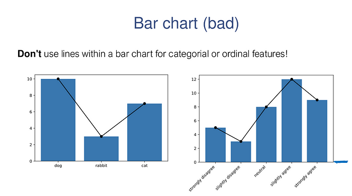
# DON'T DO THIS
plt.bar(range(len(counts)), counts.values(), tick_label=list(counts.keys()))
plt.plot(range(len(counts)), counts.values(), 'ko-')# DON'T DO THIS EITHER
data = {"strongly disagree": 5,
"slightly disagree": 3,
"neutral": 8,
"slightly agree": 12,
"strongly agree": 9}
plt.bar(range(len(data)), data.values())
plt.xticks(range(len(data)), data.keys(), rotation=45, ha="right")
plt.plot(range(len(data)), data.values(), 'ko-');
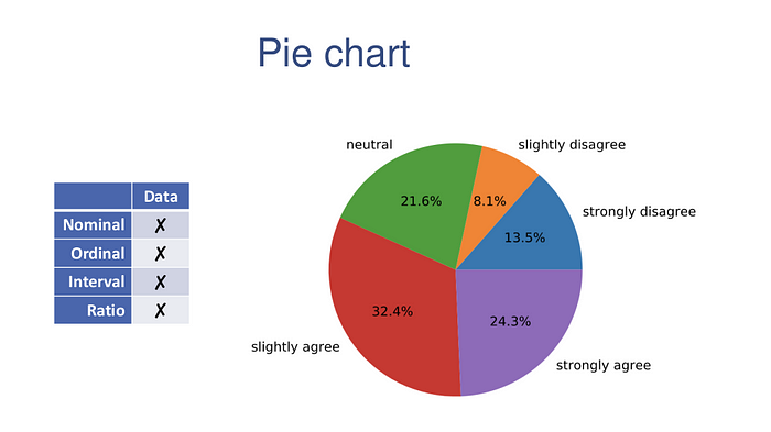
Pie charts can also be used to plot 1D categorical data. Pie charts offer remarkably little information, especially if you have more than 2 (or at most 3) different categories. Should you decide to go that route, here is the code that does it
plt.pie(data.values(), labels=data.keys(), autopct='%1.1f%%')
plt.axis('equal');
Histograms show frequency counts as well. Histograms are the workhorse of exploratory data analysis.
np.random.seed(0)
data = np.concatenate([30 + 4*np.random.randn(10000),
18 + 2*np.random.randn(7000),
12 + 3*np.random.randn(3000)])
plt.hist(data, bins=50);
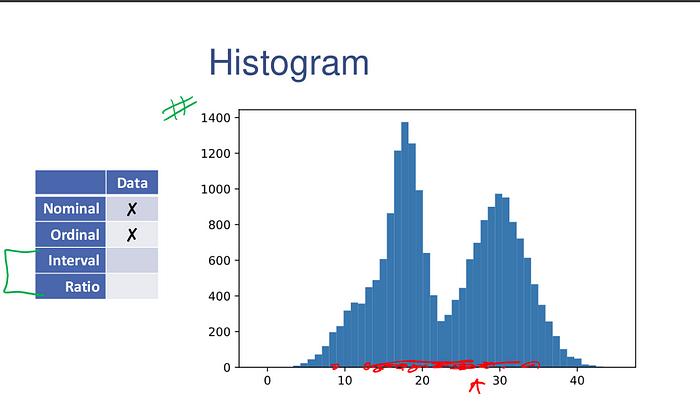
The entire range of the data is divided into bins number of equal-sized bins, spanning the entire range of the data.
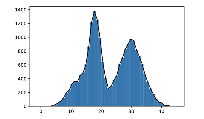
It also is not incorrect to create a line plot showing the overall shape of the distribution.
y,x,_ = plt.hist(data, bins=50);
plt.plot((x[1:]+x[:-1])/2,y,'k-')
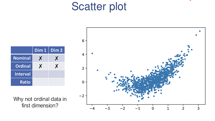
Two dimensional data could either be numerical, categorical, or of mixed types.
If both dimensions of the data are numeric, the most natural first type of plot to consider is the scatter plot.
x = np.random.randn(1000)
y = 0.4*x**2 + x + 0.7*np.random.randn(1000)
plt.scatter(x,y,s=10)
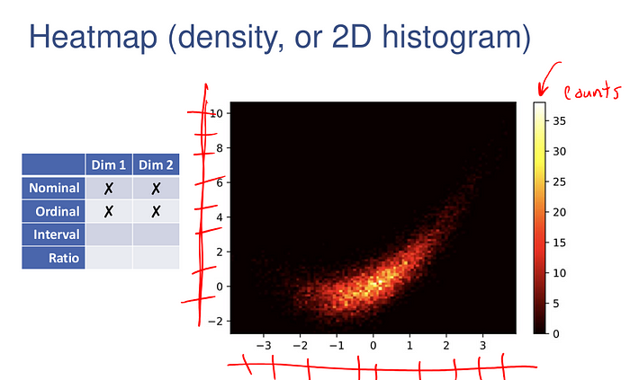
In this case of excess data, we can also create a 2D histogram of the data (which bins the data along both dimensions), and indicate the “height” of each block via a color map.
plt.hist2d(x,y,bins=100);
plt.colorbar();
plt.set_cmap('hot')
Choose Colormaps Carefully
Several factors to consider. For example:
• Accessibility
• Printing in grayscale
• Unintentional boundaries
• Intentional boundaries
• Color semantics
Accessibility
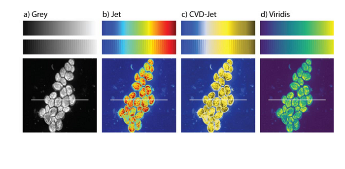
Image: https://journals.plos.org/plosone/article?id=10.1371/journal.pone.0199239
Printing in grayscale
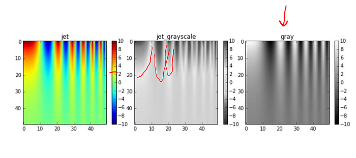
Image: https://jakevdp.github.io/blog/2014/10/16/how-bad-is-your-colormap/
Unintentional boundaries
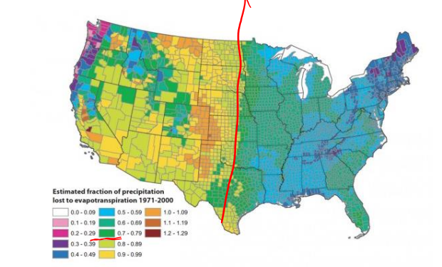
Image: https://eagereyes.org/basics/rainbow-color-map
Intentional boundaries

Image: https://weather.com/maps/currentusweather
Color semantics
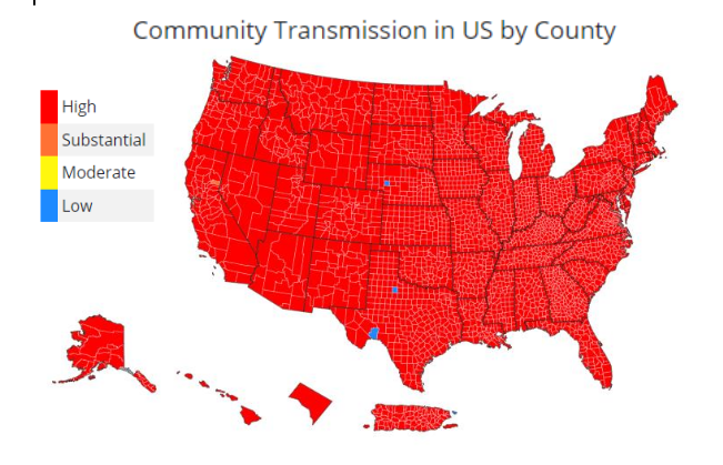
Image: https://covid.cdc.gov/covid-data-tracker/#county-view
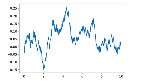
The following examples illustrates how to use the plt.plot for a simple line plot.
x = np.linspace(0,10,1000)
y = np.cumsum(0.01*np.random.randn(1000))
plt.plot(x,y)
Let’s consider a simple example, where here (just with fictitious data), we’re plotting pet type versus weight.
data= {"dog": 30 + 4*np.random.randn(1000),
"cat": 16 + 10*np.random.rand(700),
"rabbit": 12 + 3*np.random.randn(300)}
plt.scatter(np.concatenate([i*np.ones(len(x)) for i,x in enumerate(data.values())]),
np.concatenate(list(data.values())))
plt.xticks(range(len(data)), data.keys());
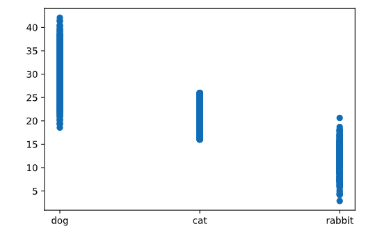
Very little can be determined by looking at just this plot, as there is not enough information in the dense line of points to really understand the distribution of the numeric variable for each point.
It plots the median of the data (as the line in the middle of the box), the 25th and 75th percentiles of the data (as the bottom and top of the box), the “whiskers” are set by a number of different possible conventions (by default Matplotlib uses 1.5 times the interquartile range, the distance between the 25th and 75th percentile), and any points outside this range (“outliers”) plotted individually.
plt.boxplot(data.values())
plt.xticks(range(1,len(data)+1), data.keys());
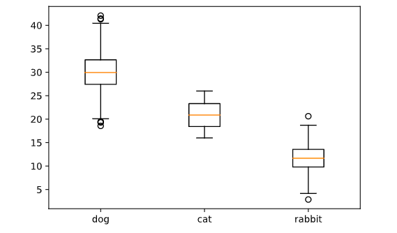
The box and whisker statistics don’t fully capture the distribution of the data.
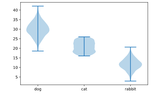
It creates mini-histograms (symmetrized, largely for aesthetic purposes) in the vertical direction for each category. The advantage of these plots is that they carry a great deal of information about the actual distributions over each categorical variable, so are typically going to give more information especially when there is sufficient data to build this histogram.
plt.violinplot(data.values())
plt.xticks(range(1,len(data)+1), data.keys());
Considering a fictitious data set of pet-type vs. house type:
types = np.array([('dog', 'house'), ('dog', 'appt'),
('cat', 'house'), ('cat', 'appt'),
('rabbit', 'house'), ('rabbit', 'appt')])
data = types[np.random.choice(range(6), 2000, p=[0.4, 0.1, 0.12, 0.18, 0.05, 0.15]),:]label_x, x = np.unique(data[:,0], return_inverse=True)
label_y, y = np.unique(data[:,1], return_inverse=True)
M, xt, yt, _ = plt.hist2d(x,y, bins=(len(label_x), len(label_y)))
plt.xticks((xt[:-1]+xt[1:])/2, label_x)
plt.yticks((yt[:-1]+yt[1:])/2, label_y)
plt.colorbar()
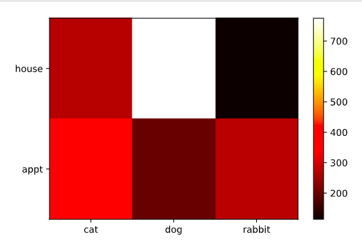
the range of colors is admittedly not very informative in some settings, and so a scatter plot with sizes associated with each data type may be more appropriate (this is also called a bubble plot). This can be easily constructed from the results of our previous calls.
xy, cnts = np.unique((x,y), axis=1, return_counts=True)
plt.scatter(xy[0], xy[1], s=cnts*5)
plt.xticks(range(len(label_x)), label_x)
plt.yticks(range(len(label_y)), label_y)
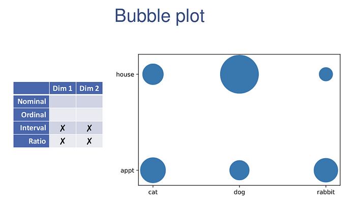
They can be quick and easy visualizations of the data.
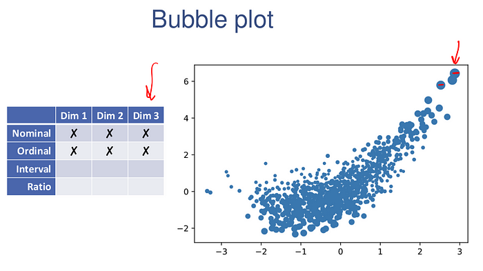
Going beyond two dimensions, effective visualization becomes much more difficult.
Much like the pie charts, avoid 3D scatter plots whenever possible. The reason for this is that they don’t work well as 2D charts: out of necessity we loose information about the third dimensions, because we are only looking at a single projection of the data onto the 2D screen. For examples, consider the following data:
x = np.random.randn(1000)
y = 0.4*x**2 + x + 0.7*np.random.randn(1000)
z = 0.5 + 0.2*(y-1)**2 + 0.1*np.random.randn(1000)from mpl_toolkits.mplot3d import Axes3D
fig = plt.figure()
ax = fig.add_subplot(111, projection='3d')
ax.scatter(x,y,z)

It is virtually impossible to understand the data. The one exception to the rule against 3d scatterplots is explicitly if you want to interact with a 3d plot: by rotating the plot you can form a reasonable internal model of what the data looks like. This can be accomplished with the previously mentioned %matplotlib notebook call.
This plot shows all pairwise visualizations across all dimensions of the data set.
import pandas as pd
df = pd.DataFrame([x,y,z]).transpose()
pd.plotting.scatter_matrix(df, hist_kwds={'bins':50});

Do not try to use these for data presentation. It will take a great deal of time staring at your problem before you really understand the nature of the data as presented in the scatter matrix, and its sole use is in trying to see patterns when you are willing to invest substantial cognitive load.
plt.scatter(x,y,s=z*20)
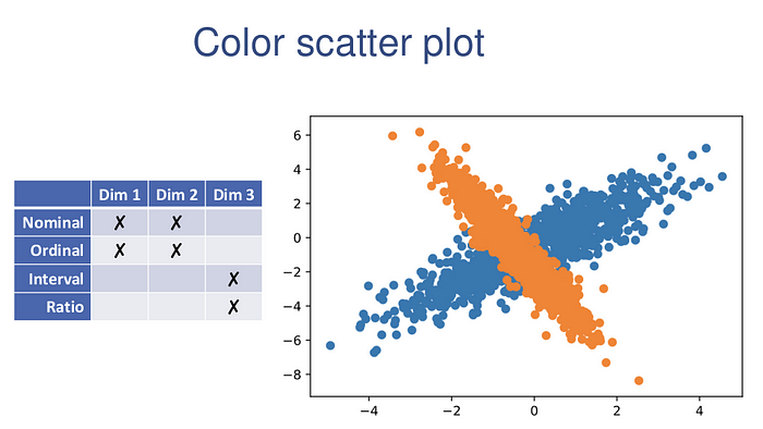
One setting where using color to denote a third dimension does work well is when that third dimension is a categorical variable.
np.random.seed(0)
xy1 = np.random.randn(1000,2) @ np.random.randn(2,2) + np.random.randn(2)
xy2 = np.random.randn(1000,2) @ np.random.randn(2,2) + np.random.randn(2)
plt.scatter(xy1[:,0], xy1[:,1])
plt.scatter(xy2[:,0], xy2[:,1])
Please like and leave a comment, let us know how to improve.
Thank you!!